Content
According to the latest market forecasts, the global SaaS market will reach $702.19 billion by 2030. The growing demand for a single solution is driven by SaaS platform availability, efficiency, scalability, and high data security. SaaS solutions are applicable for organizations of any size and business needs.
However, such a demand leads to the high competition that adds a new challenge for both novice and thriving market participants. Thus, many businesses choose alternative ways to succeed and win this competitive battle. One such way is to create an attractive and user-friendly SaaS design to help different companies reach the target audience, gain customer loyalty, and reduce user churn.
As a company that provides SaaS product design and development services, we’d like to share our knowledge to help you create outstanding SaaS platform design. From highlighting top-performing SaaS design trends to practical tips from our design team, this guide covers everything you need to know about SaaS app design.
SaaS design overview: top trends in 2024
The high demand for SaaS solutions creates competition for companies trying to join the thriving SaaS community. This situation leads to rapid industry innovation and quick changes in SaaS platform design standards. Below, we provide a list of the top-performing SaaS design trends in 2022 that you should embrace to succeed.
Clean design
When you design your SaaS platform, it’s better to focus on keeping your interfaces simple and displaying the most relevant elements. The clean and simple SaaS app design is easier to understand and use, especially if you want to focus your users on products or services to sell. This way, you won’t lose customers’ attention or waste users’ time due to cluttered design.
Balanced use of color
Your users shouldn’t be distracted by an over-the-top color palette that irritates their eyes. Color minimalism is the proven way your design will work well on your users. We suggest choosing one or two primary colors depicting the single brand style and then adding accent colors for call-to-action buttons or navigation menus. This way, you’ll draw users’ attention to the main content and make it easy to read.
Readable headings
By using large and readable headings, you will make the user experience much easier and more logical. Follow a visual hierarchy to highlight the importance of blocks and sections, and first, make important content bolder to help users act quickly. After that, you can display less important things in less bold and smaller headings.
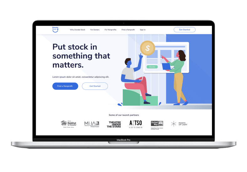

RewiSoft Case – smart crowdfunding platform Design
Data visualization
One more way to simplify user interaction is visualizing complex data through charts and interactive infographics. Data visualization is a valuable component of a good SaaS platform design: the less effort users put into understanding the data displayed on the screen, the higher your website’s conversion rate and user satisfaction.
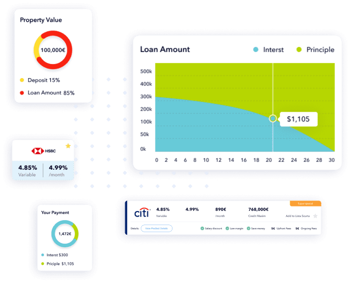

RewiSoft Case – Mortgage Platform Design
Illustrations and graphics
Include illustrations and graphics if you want to create an eye-catching SaaS web design. Through illustrations, you’ll be able to express your unique brand identity and positioning. With graphics, users will immediately get an idea of the primary information, and it will be easy for them to navigate your SaaS platform. Combining these design approaches will increase user trust in your brand and make their experience more convenient.
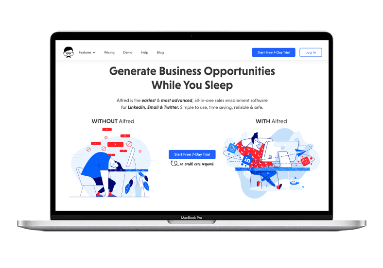

RewiSoft Case – sales enablement software design
Index menus
The following significant SaaS design trend is index menus that recently came to replace drop-down menus. Users can view menus with service and product icons by hovering over such menus. Each icon can briefly describe a service or product, which helps users understand whether they should click on or stay on the page and find what they need. This reduces users’ time to complete an action and makes it easier to interact with SaaS products.
Wonder to understand how to design a SaaS application to upgrade an existing solution? Learn more about how to redesign your app in 2024.
Examples of good SaaS app design by RewiSoft [Case Studies]
RewiSoft’s design team is highly experienced in designing great products from scratch and improving existing designs for our customers in the SaaS market. Let us show our practical contribution to creating user-centric and convertible SaaS platform designs based on two real cases.
MeetAlfred: sales enablement software for LinkedIn, Email & Twitter
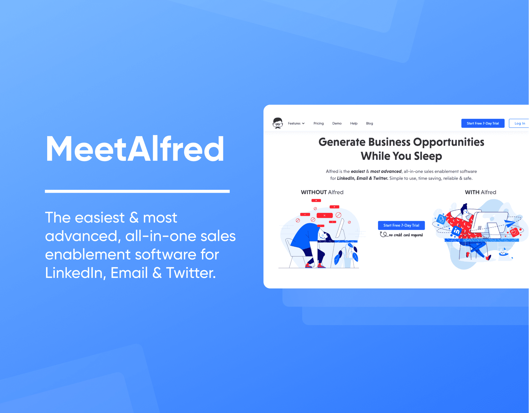

MeetAlfred
MeetAlfred is an easy and advanced all-in-one sales enablement software for LinkedIn, Email, and Twitter. Companies access this SaaS platform to find their target audience, launch and optimize marketing campaigns to grow business efficiently.
Our customer approached us with an existing desktop application that needed to be rebranded and redesigned for a SaaS cloud platform.
Challenges:
- Expand the platform’s functionality
- Create a new marketing website and design solutions to access a wider audience
- Improve SaaS UX design
- Update UI
As part of the UI/UX SaaS design, we have completed such tasks:
- Performed stakeholder and user interviews to obtain the original product idea, collect customer requirements and sketch the design ideas and relevant elements to display
- Described personas for four target audiences of the application (marketing and advertising, professional services, IT and software, recruiters)
- Created customer journey map and user flow to visualize the user interaction, provide clear navigation for users, and understand the entire product experience from the user’s perspective
- Performed user testing to prioritize real user requests and make improvements
Solutions:
- A brand new design system that maintains product identity and core message
- Updated UI design in a minimalistic and stylish manner
- Implemented login features
- The interactive onboarding function for the user to help him get acquainted with the functionality of the platform
- User-friendly and customizable dashboards that allow users quickly launch campaigns and effortlessly navigate through sections
- New functionality for the contacts page to see more information about each of their contacts
- Redesigned the marketing website so it can reach different audiences
Results:
Our team managed to redevelop and redesign the platform while maintaining its original value for business and users. More than 100,000 users use the SaaS platform to grow their businesses and run workable campaigns.
Referrizer: advanced marketing automation platform
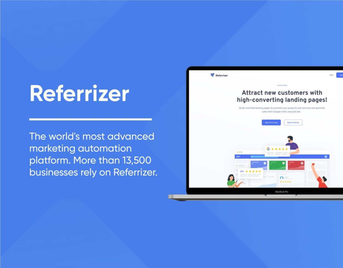

Case Referrizer
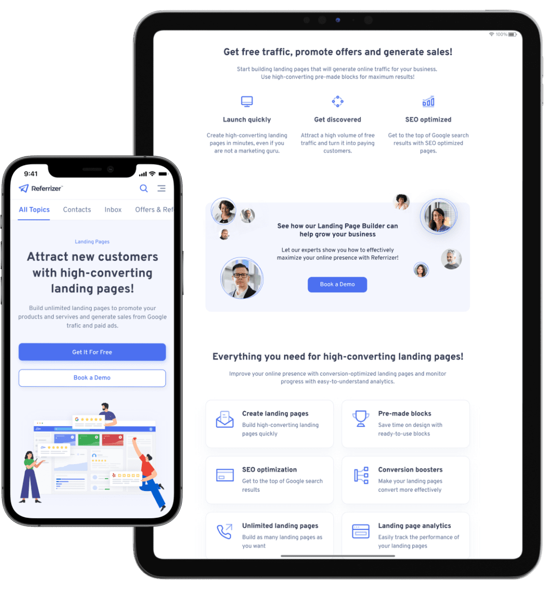
Referrizer is an advanced marketing automation platform that helps businesses grow their customer base and generate long-term marketing results by increasing referrals, boosting user retention, and improving Google’s local reputation.
Our customer came to us with a need to move from a typical marketing platform to evolutionary automation software that will push business to the next level.
Challenges:
- Improve SaaS UX design
- Build the application strategy and design process from scratch
- Make the platform design user-friendly, easy to navigate, and attractive to end users
As part of the UI/UX SaaS design, we have completed such tasks:
- Performed stakeholder and user interviews to grasp the customer goals
- Developed clear wireframes and reorganized the main content by focusing users on more important information
- Performed user testing to prioritize real user requests and make improvements
- Redesigned the layouts to make them intuitive for different user groups
- Developed a completely new design system, changing the original style of the platform, but retaining the brand’s unique style, identity, and core message
- Reworked the UI design on the Referrizer reputation management module, dividing it into the four blocks
Solutions:
- A user-friendly and customizable dashboard that allows users quickly view essential information through interactive charts, blocks, and graphs
- “Boost reviews” page that shows different ways to interact with the target audience
- “Review management” block to help businesses process user reviews faster
- The product’s responsive design version that adapts to any screen size and allows users to use the platform from any device
- Convenient in-app navigation by optimizing the dashboard and allowing users to find the information they need at any stage easily
- Appropriate filtering to improve user interaction with the SaaS platform
Results:
Today, over 13,500 businesses rely on this SaaS platform, thanks to the RewiSoft design team’s valuable contribution. Our team has managed not only to create new UI/UX design but improve the product’s performance in the long run and become attractive to businesses of any size.
How to design a SaaS application in 7 steps?
To offer our customers a smooth user experience and attractive user interfaces for SaaS products, RewiSoft’s design team follows six steps throughout the process. Let’s consider each in detail.
Step 1: Conduct market research and create UVP
One of the most critical steps to creating a unique product design begins with collecting and analyzing requirements. Before the design team starts creating a SaaS design, it’s vital to know the overall solution idea concept and analyze end-user needs and competitors as a whole.
For these reasons, we start by conducting customer interviews to get an accurate insight into the customer’s future SaaS product design vision.
Next, our team converts the data collected through this research and interviews into an accurate hierarchy – information architecture. This serves as a resource for creating detailed user flows, which are a set of tasks that a user performs to complete some process when interacting with a SaaS product.
However, your team should elaborate on one more important task to understand how this solution is helpful – creating a unique value proposition (UVP). To do this, you need to have a clear picture of the product you want to deliver to the target audience. In a highly competitive market, it is better to enhance the UVP with various design elements such as product videos, animations, highlighted call to action, customer testimonials, company awards, etc.
Step 2: Start with MVP
In creating a viable design solution, you should validate the idea and understand the pain points your solution solves for users. One of the most effective and affordable ways to do this and test the demand is to create a minimum viable product (MVP). This way, you can engage your target audience, get honest feedback, find out how your SaaS solutions can solve their problems, and give you an idea of their primary needs.
To summarize, building an MVP means:
- Gather your target audience feedback
- Test your product on real users
- Prioritize the list of features for the next development stages
- Increase brand awareness
- Get your first return on investment (ROI) if your idea is worthy
Step 3: Identify app personas and user journey
Before we understand how to design a SaaS application, we should clearly understand who your users are. By identifying app personas, we can understand the main categories of users who will interact with your solution.
Next, we create a user journey consisting of user personas, touchpoints, and interaction scenarios (with expected outcomes). Creating a user journey is a way to understand the entire experience from the user’s perspective. User journey represents all touchpoints when your customer interacts with the product. Such touchpoints can be website design, chatbots, live chat, social media, etc.
As a result, the user journey helps our team create a great user experience where we can see what each app persona is experiencing when interacting with the product, including emotional feedback.
Step 4: Go for SaaS UX design
Regarding user experience, product design is vital in determining how it will be. That’s why our designers create simple and user-friendly wireframes to make user interactions simple and non-distracting.
Prototypes and wireframes are preliminary models of the look and feel of your final product, which may include content, visual design, and interactivity. Once they are ready, we test these SaaS prototypes on target users before release to improve the final experience.
Step 5: Move to UI design
To define the visual attractiveness of a SaaS solution, we follow the top design trends and practices to create a good UI. We make a unified style guide and visually appealing product interfaces that match the unique app specifics.
In this regard, we are guided by the minimalist design trend, choosing a two-tone palette and placing accents where it is needed most. The primary goal of the UI is not only to interest but also to set impressions and drive conversions.
Step 6: User testing
While conducting user testing, you can test the product from the end user’s perspective. Next, you obtain honest feedback and can use this information to make improvements, fix bugs, or make updates.
At RewiSoft, user testing relies on the individual approach of our in-house UX lab. The Eye Tracker tool is a tool that allows real-time eye tracking to improve product usability. User testing with an eye-tracking tool allows us to improve conversion, fix bugs, and get a user-friendly product. !
Step 7: Consult with a professional design team
To maximize efficiency and improve your final product design, it’s best to partner with a professional design team with extensive experience in the SaaS industry. Thus, you can minimize the risks associated with redesigning the product while wasting time and resources. The experienced design team will consult you on any question and concern, providing the best solutions to increase conversions and user retention.
Key aspects of SaaS UX design
Key aspects of good UX are built around helping users save time, reducing frustration, and showing them what to do next. That’s why, to achieve a better UX, companies should focus on making interaction simple and clean while leaving a feeling of a full-featured SaaS solution.
Following UX best practices, RewiSoft designers take a user-centric approach to create an easy-to-navigate and user-friendly product experience. One such practice is our in-house UX lab.
Together with the best design trends, user testing, and experience gained from regular practice, we do our best to create a great user experience with the UX Eye Tracker tool. This tool provides a deeper understanding of user behavior patterns by capturing the movements of a person’s gaze.
This helps determine where and for how long the user is looking. Using this tool, our team analyzes what users pay the most attention to and what they skip. This helps us find ways to boost conversion and eliminate useless elements.
Best practices of Software as a Service design: tips from RewiSoft designers
To understand how to design a SaaS application right, let’s continue the topic of top-performing design practices and discuss the ones we consider the best.
Engaging onboarding
SaaS software’s onboarding feature greatly influences how well users will interact with your application. Thus, we recommend making the onboarding process smooth, simple, and interactive. Explaining complex things in simple terms and catchy design elements will positively impact the overall user experience and hook the audience from the beginning. The typical examples of engaging onboarding elements are:
- Button backlight
- Text hints
- Guide walkthrough
Gamification
Adding gamification elements into the overall SaaS app design can make the user experience more enjoyable. The gamified apps motivate users to engage with your solution by collecting specific points or winning awards.
In this case, the design team can represent the game elements once the user performs a specific action through:
- Visuals
- Scoring systems
- Rewards
- Achievement gifts.
Easy signup
Make the signup process simple and easy to save users time filling out multiple sheets and forms. To achieve these goals, you can request only relevant data enough to signup in a few moments.
It’s also more reasonable to add additional registration features via Facebook, Google, Apple, etc., so users can instantly access your solution. You can also ensure easy signup by placing a solid call to action on the landing page that encourages users to take action.
Navigation
Creating intuitive and easy-to-navigate SaaS platform interfaces is another good practice to ensure great design. Ease of use will help convert users faster while providing them access to all essential features.
To meet this criterion, start by creating a logical page hierarchy where different data has a different pagination layout. This way, you will avoid user confusion and create an easy-to-navigate SaaS platform design.
Dynamic sorting
The dynamic sorting feature helps make it easier for users to search and get the results they need. Otherwise, you will increase users’ time for lengthy searches for the information they need, leading to a high bounce rate. Also, add a wide range of filters to the product to help users narrow down the resulting output.
Clear UI design
Complex and annoying design elements can easily confuse your users and make them leave your website. To enhance user engagement and acquire the interest of a wider audience, elaborate on clear UI design. This entails adding simplicity and accessibility so users can easily interact with your SaaS solution and have a positive experience.
Personalization
Personalizing the user experience automatically adds more value to your SaaS solution. Collect data about your users to create personalized offers tailored to their needs and preferences. You can also display only relevant information and hide irrelevant items when users log into their accounts.
User-friendly dashboard
Well-designed dashboards are imperative to delivering a high-quality user experience. Your target audience should access all tools with minimal effort. To create both a user-friendly and functional dashboard, stick to the following rules:
- Provide less content
- Prioritize the data visualization
- Provide customization options to your users
- Add company branding
- Make sure to have clear navigation options so users can easily navigate between pages
- Provide advice on how to use the dashboard
Keeping the best SaaS design practices in mind, explore how to develop a SaaS application and ensure a successful release.
SaaS web design mistakes to avoid: tips from RewiSoft Design Team Lead
To create a highly converting SaaS web design, it’s best to strike a balance between complex back-end architecture and clean interfaces. In parallel with the description of the best practices, let’s analyze common design mistakes that you should avoid.
Crowded landing page
You should create landing pages prioritizing relevant information. The audience should engage with your solution easily without losing the main point you’re driving at. To do this, avoid complex elements and chaotic structures and stick to the best design trends and practices. This way, your audience will subscribe to notifications and respond to the call to action faster.
Excessive clutter
Remove visual clutter by avoiding content overload, confusing logic, and striking imagery. Today, users appreciate a clean, clear, and well-organized UI so they can easily find what they need without distraction. Ensure visual order to decrease cognitive user’s load and improve retention. You can run a series of user studies on all kinds of websites to create a well-balanced design.
Dark background
The dark background is hard to read and leaves a negative impression. But, it doesn’t mean you should totally avoid black colors. Instead, learn to use dark color schemes with light and unsaturated accent colors. Also, keep in mind that dark themes are suitable for a specific group of digital products that fit their brand and do not require a lot of shapes, components, and widgets.
Hard-to-read fonts
Typography in UI design is crucial to ensure easy visual reading. Users should easily read the content and want to continue. The choice of fonts shouldn’t result in a competition for creativity. A professional design team follows basic principles of color and contrast, hierarchy, scale, size, spacing, and text alignment before choosing the one that suits your SaaS solution.
Long registration process
Create an efficient registration so your users don’t stop the registration process halfway through. To do this, ask for as little information as possible and exclude all optional fields to save the user time on unnecessary steps.
Also, let users see their passwords to prevent mistyping errors easily; provide support and guidance and several registration options via Facebook, Twitter, or Google.
SaaS app design: How much does it cost and how long does it take to create?
If you are looking for a professional team to help you create a worthwhile and high-quality SaaS platform design, keep in mind some factors can affect the final project cost.
- Project size
- The design complexity
- Expected time to market
- Development approach
- Team location
- Team size
- Team expertise
- Hiring model
The SaaS design process is not the only task you can choose to delegate to professionals. You may also need help with product discovery, developing the SaaS solution, and testing it. So, let’s look at rough SaaS project costs based on project stage and team location.
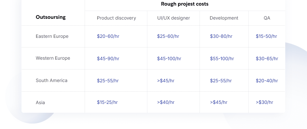

Rough project costs
For more information on project timelines, below, you can also see RewiSoft’s timeline calculations based on project size and stage.
Our work estimateAs you may see, calculating the cost for designing SaaS products requires specific project details and unique customer requirements. Get in touch with us to find an optimal design solution tailored to your case.
Software as a Services (SaaS) Design: Conclusion
Studying how to design a SaaS application, you may conclude that the success of your final SaaS solution depends on rich functionality and top-notch SaaS platform design. Having all of both will leave no chance to your SaaS industry competitors.
To take your business to the next level, hire a team with an extensive product design portfolio that showcases the team’s industry expertise. This way, you will release highly convertible designs without effort and risks of missteps.
We offer our customers our team professionalism and high commitment to creating an exceptional SaaS design. The RewiSoft design team can improve or upgrade an existing design, helping you to build the design strategy and process from scratch. Schedule a consultation.

