FinTech
Athens
5000+ employees
This bank represents the leading Bank in Greece, with a 29% market share in terms of customer loans and deposits.
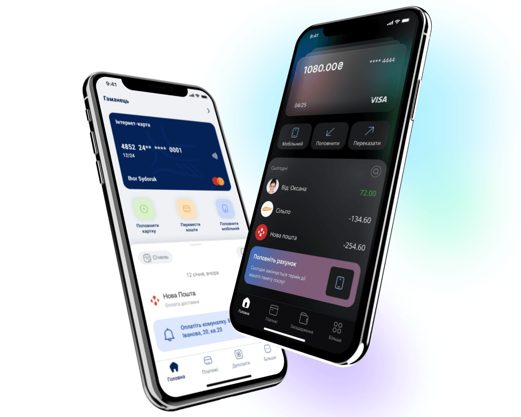
Before
The visual style looks inconsistent. There is no overall concept and well-thought-out UI. Incorrect and inconsistent use of primary color. Not fully informative and associatively understandable icons, which are used on different functionality. Different icons are used for the same functionality. Added shadows without saving the concept, which degrades the visual component. There are too many shades of gray, which complicates visual perception.
After
We increased data security by hiding the card number and name (the user will receive this data after clicking on the card). The user experience has been improved by moving the “transfer” function to the most accessible zone and the “mobile” function to the less accessible one, according to the frequency of use. We added the ability to long-click on the card number so that users can quickly copy it for further use.
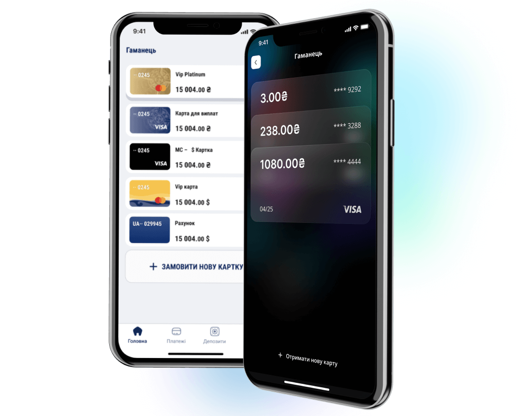
Before
The design of the cards looks outdated. There is no concept and idea. There is also no follow shadow style and button style, which makes the app look unprofessional.
After
We updated the visual placement of cards in the wallet, which will resemble a real wallet and give the user positive emotion. According to modern research, for users, a swipe is easier than a click, and during onboarding, we will give the user a hint on how to interact with the wallet. Such movement will speed up the user’s interaction with the cards, increasing the ease of use.
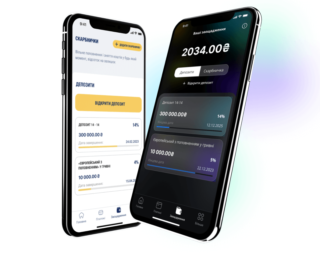
Before
On this screen, it is a mistake to use two main (accent) buttons, which is against the rules of UX. It will confuse the user and shift the focus. Also, there are too many uppercase, different styles and placement of buttons, and too many text styles look unprofessional and too flashy. There is a sense of aggressive marketing on the screen, which will make the user defensive and buy less.
After
We made several important improvements to this screen:
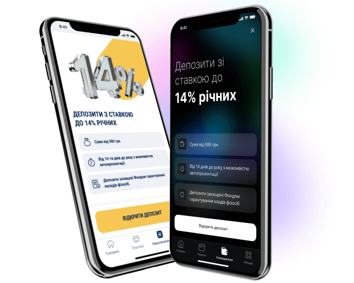
Before
Difficult readability due to upper case and bold italic letters. It is not clear how to close this screen, which is a gross violation of Nielsen’s convenience heuristics of user control and freedom.
After
As per the task, we updated the visual component and made this screen more consistent and modern.
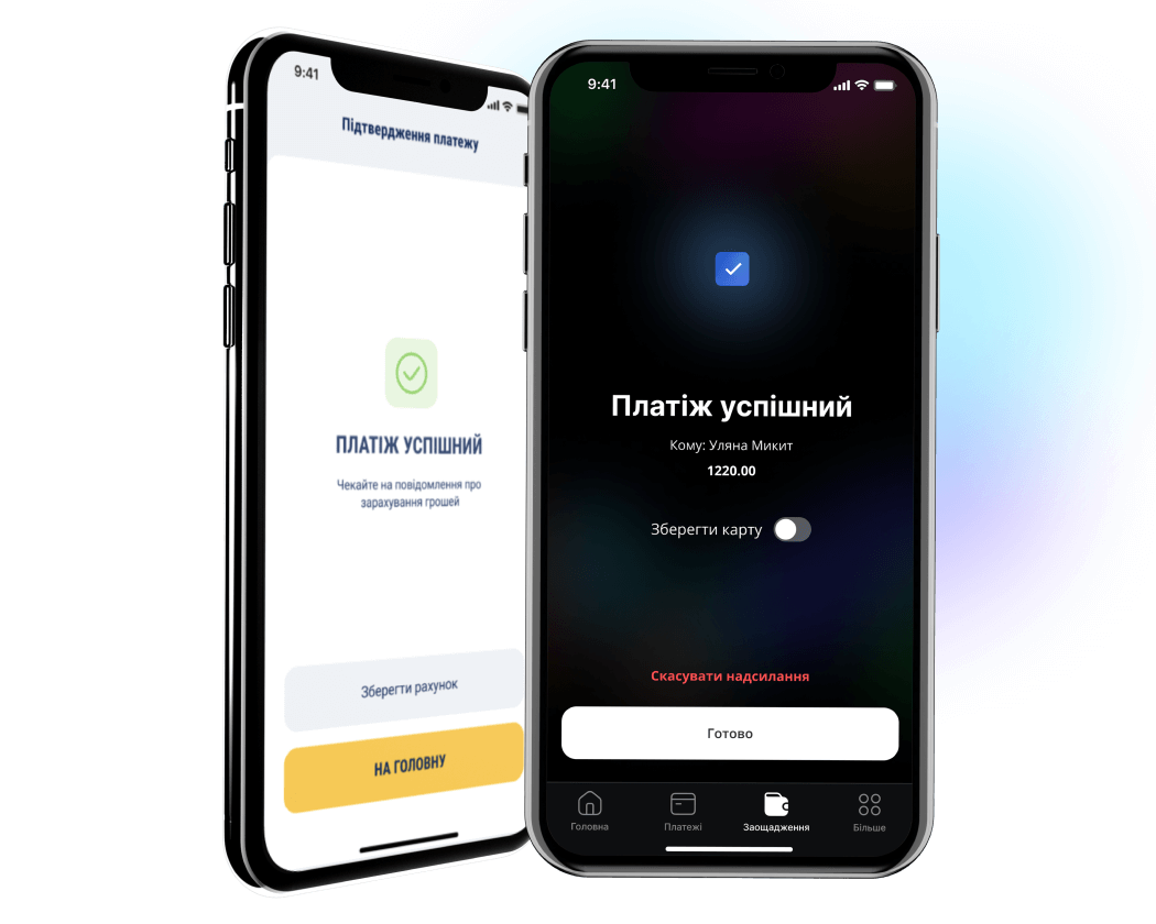
Before
There is a lack of additional information regarding the transaction details, where the money was sent, and how much. There are also very different styles of text in the buttons, which emphasizes the inconsistency and remoteness of a single concept.
After
We added two lines of important information – to whom the payment was sent and the amount because it is important to give users an understanding that they did everything correctly at each stage of the interaction. Also, we added the ability to cancel a transaction to give the user a sense of control.
As a result, our team conducted a detailed UI/UX audit of the application, highlighting the main problems and shortcomings. We offered two options for updating the visual part of the application – small changes to improve the user experience and a complete redesign to solve all issues.
Thanks to our redesign, the client received a product that attracts users, encourages them to take certain actions, and provides the ability to use money quickly and safely. After the redesign, loyalty to the bank and usability increased significantly.