E-commerce Website Redesign: Overview
Design is critical in the modern world, where you have to stand out in order to succeed. Now, you sell the user experience, not the product itself. So, if your website is not modern-looking, easy to navigate, your potential customers will choose someone else.
However, not all businesses understand it. The majority of e-commerce platforms use the same design templates. It is simple, cheap, and seems to work just fine.
But remember, if you want to form a special bond with your consumers, create a loyal customer base, you have to dedicate time, cost, and effort to the design.
How to understand whether your e-commerce website needs a redesign? How to redesign it successfully? How much does it cost? What are the critical stages of an e-commerce website redesign? We will answer these and other questions in this article.
Let’s start from the basics – how do you know when you need an e-commerce website redesign.
Why Do You Need to Redesign Your E-commerce Website?
There are many reasons why e-commerce platforms need redesign. However, we will focus most on the reasons like low conversion, unsuccessful UX, business scaling, fierce competition in the market, etc.
How can e-commerce website redesign tackle all these issues? Let’s find out together.
1. Your Platform Has Low Conversion Rate
First off, low conversion is a sign of the low profitability of your e-commerce platform. So, this issue surely needs to be mitigated. So, if you struggle to convert the website visitors into consumers – you should consider webshop redesign.
The confusing navigation, poor design, limited functionality, and the low performance of your platform directly influence the conversion rate.
But no worries, e-commerce redesign can mitigate this issue by making your platform more user-friendly or eye-catching.
2. Your Current Design is Not Relevant to Your Target Audience
Not considering your target audience while designing an e-commerce website can hamper the experience users have with your platform. Thus, it is critical to research the market carefully and identify your target audience.
3. The UX on Your Website is Confusing
What are the main signs of confusing UX, you may ask? Here is the checklist of its key indicators.
If your website corresponds to two or more, you should go for an e-commerce website redesign.
- The page takes a long to load or respond;
- The plugins are poorly integrated;
- Unclear navigation or several navigation options;
- The complicated process of the checkout (it has too many steps);
- Not enough spaces between informational blocks;
- The absence of the “search” feature;
- Too artsy fonts;
- Unmatching colors of the page.
4. You Want to Adopt Mobile-First Approach
If your target audience is approximately 25-30 years of age, they are highly likely to prefer in-app purchases to shop on the website. In that case, going mobile-first when designing is a viable choice. Such an approach, however, takes e-commerce website redesign.
5. The Trends in Your Market Niche Change Fast
The 20th century is an age of fast information, and market trends change promptly. To be successful, however, it is critical to keep up with the latest trends of many spheres, the design included. Outdated websites don’t engage new users. Keep that in mind when deciding whether or not to go through website redesign process steps.
6. Competition in the Market is Fierce
The webshop redesign is worth considering if you see that market standards have changed. Perhaps, new trends will appear, and your platform risks becoming outdated.
7. You Want To Scale Your Business
Scaling your business typically presupposes expanding your audience or conquering new markets. This results in more people coming to your website. To convert the visitors into buyers, you need to pay close attention to your e-commerce platform design.
8. You Would Like to Change Your Marketing Strategy or Brand
It’s critical to go for your e-commerce platform redesign if you plan to rebrand your business. To target your market, you should be consistent if you want your clients to identify your brand and make repeat purchases.
Rebranding required webshop redesign because:
- Changed branding strategy calls for design changes;
- The logo of your company has gone through a makeover;
- Your platform’s functionality has been modified.
9. New Functionality
Adding new features to your e-commerce platform makes the page more complex. Thus, it can become not user-friendly. As a result, to mitigate the risks of losing your potential buyers, you need to go for your e-commerce platform redesign.
10. Tech Stack Update
Like new functionality, the adoption of new technologies calls for an updated design. If you neglect design renewal, your users will be confused because of the contrast between modern functionality and outdated design.
No matter what are the reasons you opt for webshop redesign, there are some trends in the latter. What are they? Let’s take a look together.
Trends in E-commerce Website Redesign
According to the Top Design Firms, almost half of users (42%) leave a website in case it functions poorly. So, it is critical to keep your platform on track in terms of both design and functionality.
However, what does it mean that a website is in trend? Let’s take a look at some of the e-commerce website design trends together.
Enjoyable filter functions
Filtering product searches is challenging for e-commerce. Where do men’s shoes belong? To the section “for men” or to the shoe section? Yes, logical categorization is no easy task for designers. The broad functionality of a filter feature comes from practicality and effectiveness. Fun design, at the same time, is just a bonus.
Neutral colors of a background
A white background is considered outdated for modern websites. Instead of it, many e-commerce platforms decide to make the background neutral. Yes, colors like grey, sand, soft brown, or green conquer the design market.
Why is it so? Unlike bright colors, they don’t overwhelm your users and allow them to focus on the content of your platform. Unlike white, they look fresh and modern.
Multidirectional layouts
Many brands create multi-product galleries with grids that go left-and-right, diagonal, or even forwards and backward. This approach to navigation allows users to move in whichever direction they wish to.
What’s more, often multidirectional grids are accompanied by flashy animated transitions.
But how to start the redesign process? What are the website redesign process steps? Let’s discover together.
E-commerce Website Redesign: Step-by-Step Guide

Why choose RewiSoft
There are different approaches to e-commerce website redesign. Logically enough, different approaches comprise different steps. In this article, we will cover the website redesign process steps, which are proven to be the most effective from the RewiSoft experience.
E-commerce Website Redesign: How RewiSoft Can Help?
Step 1. Usability Audit
Customers often struggle to understand the reasons for low conversion and ratings, as well as high churn rates. To learn the causes, RewiSoft professionals perform UI and UX usability audits. They are aimed to identify bottlenecks in the interface. After that, our experts suggest how to make the website easy to interact with.
Step 2. Product Discovery
Once you understand the reasons for the low performance of your e-commerce platform, you need to continue to the product discovery stage. At this stage, RewiSoft specialists carefully research the market, conduct a competitor analysis, as well as the analysis of your target audience.

RewiSoft Example: Personas
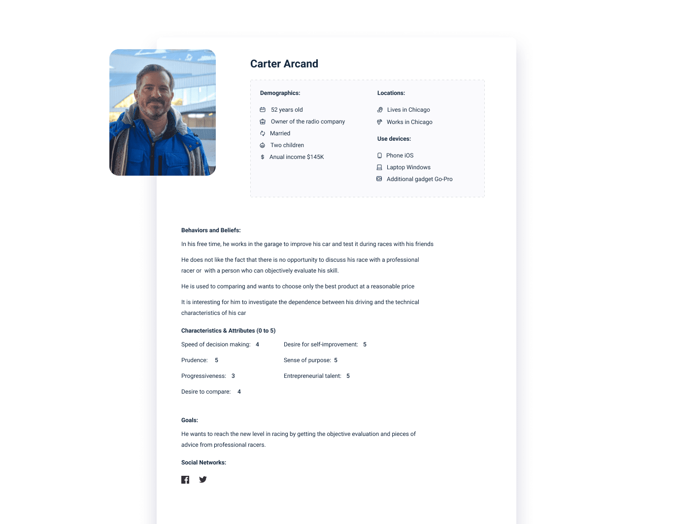
Also, during this stage, it is critical to identify business, users, and discovery goals, create user stories and customer journey maps. All these activities help to get through information on the product itself, the market it will operate on, its target audience, etc.
RewiSoft team has helped our client E-Wish with product discovery.
E-Wish is the UK’s multifaceted marketplace that includes different services, e-commerce, apartment rent, and taxi booking. This platform allows users to satisfy all kinds of their needs with a few clicks.
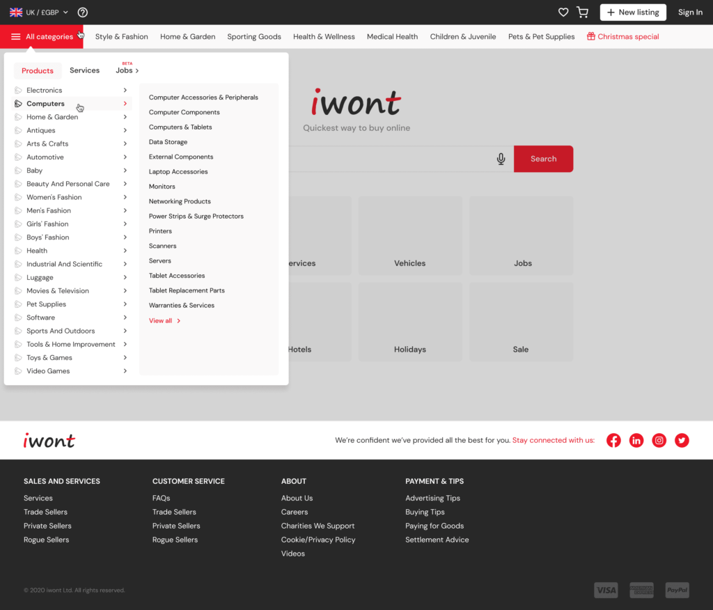

RewiSoft Case Study: E-Wish
At this stage, our experts were:
- identifying business and user goals;
- performing stakeholder & user interviews;
- conducting market research;
- developing monetization strategy;
- researching categories and subcategories;
- creating personas.
Step 3. New UX Design
Before this phase, make sure the goals of your UX redesign are clear. Once you have the necessary information and have identified the changes required, it’s time to begin the e-commerce redesign. The key activities RewiSoft can help you with at this stage are:
- sketching your ideas;
- developing prototypes;
- gathering user input;
- make design decisions.


RewiSoft Cast Study: E-Wish
Based on the concept of the application and its design, we prepared a roadmap to start the UX design process. During this stage, we have created the information architecture and wireframes.
Step 4. New UI Design
You can continue with the UI redesign when the UX redesign is ready and tested. Consistency is the most critical aspect of the UI redesign stage. RewiSoft experts will make sure that all interface elements on your website will be of the same style, use your brand colors, and pick the fonts that will suit you the most.
In terms of UI, RewiSoft team has helped E-Wish to design the system and create an accessible interface, worked on its usability and likeability, as well as emotional design.
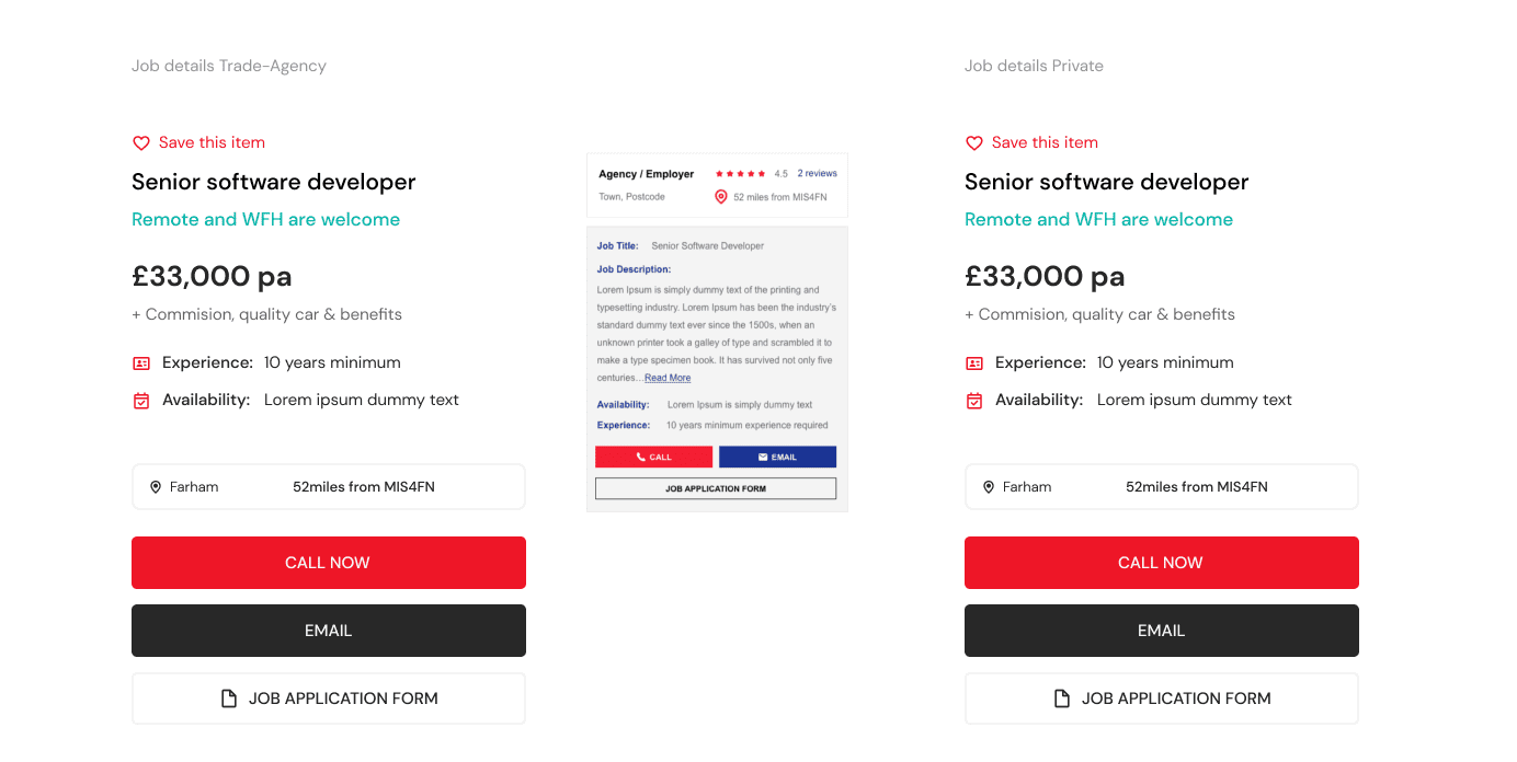

RewiSoft Case Study: E-Wish
Step 5. Testing by Our UX Lab
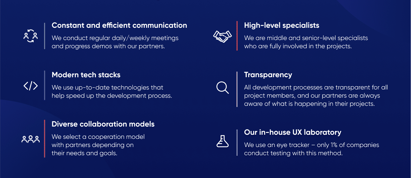
RewiSoft is among 1% of companies that use UX Eye Tracker methods to perform user testing. This approach is used to explore user behavior when interacting with the product. An eye tracker captures the movement of a person’s gaze. It is needed to track and record where and for how long the user was looking.
This eye-tracking tool provides RewiSoft experts with a deeper understanding of behavioral patterns.
Apart from UX Eye Tracking, our specialists conducted in-depth interviews of focus groups, performed assessment research, and worked on usability reports.
Step 6. Development and Launch
After the whole design is ready, you can start the development process. It is critical to hire developers who can completely turn the design into a working product at this stage.
Make sure that the backend and frontend parts meet all your requirements. When everything is ready, you can launch your redesigned product.
But how to ensure a successful e-commerce redesign? RewiSoft experts are here with some answers and tips.
E-commerce Website Redesign: Tips & Tricks
We have compiled a list of best practices that will help you succeed and experience the benefits of redesigning a website.
1. Don’t Try to Redesign Your Whole Platform at Once
You don’t have to redesign everything completely. In most cases, you only have to redesign certain parts of the e-commerce platform that prevent you from achieving your intended results.
2. Hire a Trusted Vendor
The success of the website redesign process steps heavily depends on the vendor you choose to work with. Thus, you need to approach the hiring process very seriously. Before you choose a partner, you have to carefully review their portfolio, testimonials from previous customers, overall team results, etc.
3. Have a Clear Understanding Why Do You Redesign
You can go through the website redesign process steps, but you will not experience the benefits of redesigning a website unless you have an in-depth understanding of why you are doing it. You also have to understand the results you want to achieve by redesigning.
4. Develop Robust Redesign Strategy
The wrong strategy can cast a shadow on the final result. Planning is a foundation for your product success. For an e-commerce platform to be profitable, it has to align with your business strategy.
However, all these best practices will not be beneficial enough if you don’t build user trust for your product. How to do it? Let’s discover together.
How to Build Trust in Your E-commerce Brand?
People trust other people, not authorities. Use this fact to your benefit. What’s more, experts in the field claim that user trust is the first principle of conversion. Let’s take a look at some ways to build trust in your e-commerce brand.
1. Work on First Impression
This point is about the optimal design and usability, as well as showcasing your expertise. Your e-commerce platform should be responsive and easy to navigate.
To create a positive first impression, you should also ask your clients to write reviews on your cooperation, film testimonials and think about where to place it all on your e-commerce platform. This section should be easy to find but not irritating at the same time.
2. Show off Your Product
To build trust, you need to create quality visuals for your products. No matter what you sell, without good-looking pictures, you are unlikely to build credibility and trust. People that choose to shop online don’t get to experience your product in person. So, you should provide visuals that will be as close to reality as possible.
3. Be Accessible
Usability and accessibility are the ways to build trust through design. Users trust the platforms they understand how to use and the ones that provide clear information. So, make navigation clear, minimize jargon on the platform and explain points that can be confusing to the general audience.
How to Make Using the E-commerce Website Easy?
Here are some tips that will help you make your e-commerce platform easy to use and accessible.
- Plan navigation clearly
- Develop clear navigation
- Make a simple “search” feature
- Don’t add unnecessary features to your website
- Make sure that the platform is highly performing and fast responding
- Ensure the clear division from the general to the specific
- Use the latest design trends
How to Design a Page With the Product?
The main design rule, in this case, is don’t overwhelm your user with the information yet answer all the potential questions. Photos and images make this task more manageable.
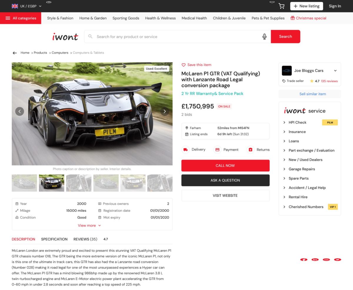

RewiSoft Case Study: E-Wish. Product Page
Add the zoom feature, allowing the user to see the small details of the items they are interested in, work on product descriptions, reviews, etc.
How to Design a User Admin Page?
This page should contain personal bonuses for your users, the purchase history, and recommendations on future purchases. Don’t add too many features, though. Keep it simple.
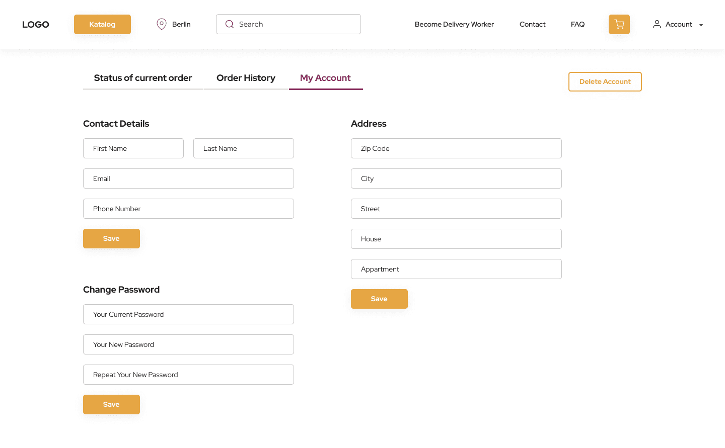

RewiSoft Case Study: 1Kauf. Admin Page
For instance, you can add features such as:
- Linking bank cards to an account on your e-commerce platform. What’s more, it is a good idea to provide a simple way of un-linking the card;
- Personal bonuses: add the information on the goods purchasing what users can get bonuses, how to spend them, etc.;
- Personal recommendations: analyze the interest of your users and provide recommendations based on these insights. For instance, if you sell clothes, show the items of a particular size, cut or color;
- Shipping information templates: allow users to fill in the shipping info once and use the same template onwards.
How Much Does an E-commerce Website Redesign Cost?
When it comes to the price of an e-commerce platform redesign, it is critical to consider several factors that directly affect it. They are, for instance, the scope of work, namely the number of pages and details, as well as contractor experience and location. Let’s view these factors in more detail.
Scope of Work: Number of Pages and Details
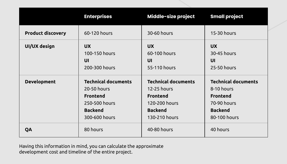
In fact, the time to complete each stage depends on a number of factors. Did you perform the necessary research? Do you understand what results you want to get? How many pages do you want to redesign?
Also, the time estimates differ according to the size of your business. Yes, due to all the approvals and many stakeholders, it takes more time to redesign an e-commerce platform than redesigning a small business website.

The following essential aspect you need to consider is the experience and location of your potential partner.
Contractor Experience and Location
The main four regions that house experienced and skilled tech experts are Eastern Europe, Western Europe, South America, and Asia. Let’s look at approximate prices for different redesign stages in different regions.
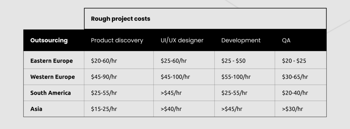

However, don’t forget that the price-quality ratio is even more important than the price itself. According to this ratio, Eastern Europe is the most prominent destination to go for.
Summary
E-commerce redesign is a journey that may either lead to success or failure. If you’re revamping your e-commerce platform, be sure to do it in line with the established standards for website development.


