An efficient learning management system is achieved when several subsystems work together to produce desired results. Those three most essential aspects are content, form, and accessibility. Design is the glue that holds it all together and is the primary means of strengthening it.
Users are influenced by design in a variety of respects. Learners must be able to navigate courses quickly. Poor design can make this more challenging for them. Teachers and learning managers want to be able to see who has and has not finished an assignment. Bad design will make it almost impossible.
With that in mind, we will look at some of the more critical facets of LMS design that you will not want to miss to help you prevent some of the most basic LMS design failings.
RewiSoft Expertise at LMS Design and Redesign
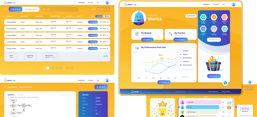
We, at RewiSoft, had a broad experience in creating LMS design and an excellent opportunity to contribute to making the learning process simpler and more accessible both for teachers and learners. Our team worked on redesigning a Singaporian platform Smartjen – a solution that is, first of all, aimed at simplifying worksheet preparation but includes many other valuable features.
We are honored to work with many notable companies and remarkable projects. RewiSoft has extensive experience in creating EdTech solutions for organizations from different industries. Our main goal is to make each product user-friendly and attractive to use.
Why is LMS custom design so important?
LMS is a critical component of the eLearning market, whether for higher education or business training. It enables students or employees to improve their learning environment, offers quick and straightforward access to content, and aids teachers in preparing, managing, and tracking courses and programs.
Consider the frustration experienced by both parties as a result of crappy (read: inferior and excessively complicated) design. To stop this frustration, the LMS design must be simple on the eyes and undemanding of the customer.
The learning management system’s user interface provides the first impression and shows how a person interacts with it. UI components include welcome screens, menus, icons, search fields, and many other elements. They can ensure a smooth and straightforward harmony of the system by being intuitive and simple. Any unnecessary action only hinders user experience.
How to design an LMS right is a question that every company should think over. A strong indication of unambiguous UI is the absence of the need for any special instruction or lengthy lectures on system navigation.
A few UI hints: keep your courses well-organized, your GUI elements stable, and the number of clicks required for an operation as low as possible. The iterative design process can be beneficial because the repeated period of prototyping and testing the product refines performance and increases overall efficiency.

What is learning management system design?
Learning management system design and user experience are critical in capturing users’ attention and holding them browsing and engaging with the content.
An LMS’s design is not only a beautiful interface. It is a very complex logic of communication between your brand and your client. The content and layout of an LMS solution should be built with a single goal in mind, whether it is to get learners to watch another video or complete a course.
The various interface features or techniques used to capture and sustain customer interest are highly applicable to the e-learning industry. Using current design trends, we named below when designing e-learning content would increase user experience.
What are the trends in LMS Design?
Here are the main LMS trends you should pay attention to:
Minimalistic Design
More designers are adopting the “less is more” philosophy. Instead of using shadows and texture, we see more websites and applications with simple designs that focus on open spaces, crisp edges, and a few bright colors.
A minimalistic style may attract attention to important details while avoiding distraction. Choose a monochromatic pattern to provide contrast and to make those components stand out. You may also use white space to declutter the pages and highlight the key points.
Mobile-Based Design
When creating learning materials, keep smartphone users in mind. Often service providers develop content for desktop users and then convert it to be viewed on smartphones and tablets without considering the various devices. As a consequence, the user experience could suffer greatly.
Improving the mobile user interface ensures that learners will be more likely to complete learning modules once they are available.
Here are three main design concepts that will make your LMS content easier to access on mobile:
- responsive design
- card-based design
- bite-size or microlearning
Analytics and the Learning Experience
Analytics provide more information on how learners interact with your content. Analytics may be used to compare two styles, for example, A/B checking to determine which style results in better knowledge retention or engagement rate. Using analytics, you can also track a learner’s strengths and vulnerabilities so that you can create personalized learning materials.
Visual Elements
One of the most critical LMS design features to look for is the ability to incorporate photos, videos, and other immersive elements into your learning materials. Infographics, graphs, and other visualizations of abstract concepts can engage learners more quickly than a paragraph of text.
Videos are an essential component since they can bring a social dimension to learning by featuring a brief lesson from a teacher, for example. When you use videos to share stories, most learners can better memorize information and stay engaged with your e-learning material.
What customers expect from your LMS Design. TOP 10 Things
Learning Management Systems are expected to make your life easier by bringing together data and deploying online training resources on a global scale.
It requires LMS that meets all your needs and comes within your online training budget. If you are thinking about how to design an LMS effectively and what essential features should be in your platform, we have prepared a special list for you. Here are ten main LMS features to consider:
- Data Migration
An effective Learning Management System should support a wide range of formats and make the data migration process as simple as possible.
- Social Media Support
Online training courses without social media components harm their corporate learners. LMS should give the ability to incorporate social learning tools into online training strategy.
- Built-In Gamification Tools
Gamification gives the power to motivate and inspire corporate learners. It gives rise to an increase in knowledge retention and online training ROI. So, an upscale LMS should contain built-in gamification tools.
- Brand Integration
Every piece of the puzzle must reflect your brand image for creating coherence. Hence, it’s necessary to search for LMS that gives you the possibility to integrate your logo, color scheme, and other brand elements. All these things should be considered if you want to expand your brand image to your online training materials.
- Customizable Reporting
The LMS you choose should have customizable reporting features. This allows you to focus on online training initiatives that are the most significant to your organization.
For example, social or informal learning activities that enrich the online training experience. The LMS should also include the most common LMS reports and analytics, such as learner performance and progress tracking.
- Collaborative Learning Tools
Some of the most useful learning opportunities come from participatory resources like online discussions, social media groups, group interaction projects, and other collaborative activities.
Your new LMS should handle these peer-to-peer interactions and provide corporate learners with the video conferencing or Project Management tools they need easily to communicate.
- Personalized Learning Paths
Online training experience is successfully provided when it is personalized. Your corporate learners need online training tools and resources that address their specific gaps.
Some LMS platforms allow you to create personalized learning paths so that corporate learners can choose online training activities and assessments based on their own performance gaps.
- Intuitive User Interface
All LMS features may be useless if you don’t know how to use the LMS. The Learning Management System should have an intuitive user interface that’s easy to use and interlock well with your eLearning team’s talents.
- Multiplatform Accessibility
A really efficient LMS should be responsive and multiplatform-friendly. Your corporate learners can get the information they need anytime and anywhere, regardless of the device they have. Furthermore, everyone should be able to enjoy the same online training experience and get the same rewards.
- Support Services
Your LMS supplier should offer free phone support and you should be able to reach them via email when you have a problem. An effective LMS should be quick to answer emails and chat over the phone.
Step-by-Step. How to design an LMS Right? Maximum ROI
People buy solutions to their problems, not a specific set of features and functions. Understanding what is valuable to customers helps create and design products that give the highest value with the minimum set of functions. Such an approach saves company resources and such products easier to promote and sell.
The process of designing LMS platforms is quite complicated but an interesting task. We have prepared a step-by-step guide that will help you create a valuable product and give all the answers on how to design an LMS system.
Who is your Audience and what they want? Checklist from our CEO
The appearance and convenience of the user interface, as well as the ease of use, influence the user’s first perception and level of satisfaction with the product. At the same time, the location of control components determines usability.
As a result, determining the target group of people is crucial in developing both the UI and UX design for a new project. Understanding the product interface target audiences allows for timely review and adds to the overall profitability of the product.
In a new project, the designer begins with user research. It aids in learning about the user, his interests and needs, as well as the motivations behind his actions.
The product target group research will also demonstrate how simple it is to use the platform, what problems the user has and what sensations arise while interacting with the product interface, as well as how successful the user interface is at solving his concern. In general, addressing the user’s challenge is critical to the potential success of every product.
How to design a learning management system so that your audience will enjoy it? We have decided to add a unique checklist from our CEO to this article.
Checklist from our CEO
- The best way to test what your audience wants is to spend time and live the history of your customer.
- Analyze your competitors and their way of communication. Who are they targeting? Thus, you can avoid many mistakes.
- Work with surveys. The best way to find out what the audience wants is to ask them. Motivate them with discounts or advantageous offers.
- Conduct a broad advertising test run, and continue to create a product for the first customers. If your mass advertising has affected them, most likely, you managed to hit the target. So identify your client’s profile and move on.
Vasyl Polych, CEO & Founder at RewiSoft
Do you have a business plan?
The main goal of creating a business plan is to evaluate the project prospects and, already at the initial stage, to detect the pitfalls that will be faced with and interfere with the realization of the intended. Design of LMS is quite a complex thing, so don’t start anything without a plan or strategy.
In skillful hands, planning becomes a very serious project management tool. With Thoughtful planning, it is possible to identify problems in advance, determine weak points, and, ultimately, promote the project’s more efficient development.
Thus, a professionally composed business plan should describe the main aspects of your project’s activities and analyze the risks with which the project may encounter in the future and make recommendations for minimizing these risks.
Do you have a Brand Identity?
Brand Identity is a combination of emotional components (hearing, visual and others), which creates brand awareness among consumers, its differentiation from competitors and the creation of synergies in communications.
Due to the identity of the brand, you can determine the company’s development strategy and focus on the entire marketing complex: prices, product management, communications, marketing channels. Brand Identity helps to establish a special relationship between consumers and the company.
Today you can allocate nine basic methods of companies branding that you can add to the design of LMS:
- geometric ornament or pattern
- color
- letters, words or whole phrases
- ornaments of fish, birds, people, animals
- plant ornaments
- lines
- special artist style
- verticals and horizontals
- more simple details
LMS design principles
Primary aspects and ideas you should follow to produce a successful design and implementation of learning management system are attractiveness, easy navigation, intuitiveness, branding, and responsiveness.
1. Attractive Design
The visual content should always be attractive. Attractiveness matters in every aspect, especially in technology and software. The other side of the extreme is putting everything designers should put everything they know into their LMS – animations, bizarre layouts, flashy graphics, neomorphism or skeuomorphism. Simplicity is also highly valued and will most likely never be out of style. The design of a learning management system must supplement the functionality, not prevent it.
2. Navigation or Ease of Use
Another essential feature of a good LMS website design is navigation, which shows how easy the user will find any platform’s desired element and complete any action.
The navigation should be free of any technical problems. All the links should be relevant and operational, and the learning path is logical and clearly accessible.
3. Intuitiveness
Every LMS item, especially icons, should be recognizable and self-explanatory for learners to reach the information without problems. Menu structure must be consistent but still change appropriately to adjust for various learners.
4. Branding
LMS design can contain a logo, color sets, shapes, or graphics. It can additionally contain company descriptions and mottos, some encouraging messages to learners and teachers.
Brand and software alignment also helps with business promotion by putting your company at the center and establishing the learning materials and ideas as your own.
5. Responsiveness
The primary goals for the learning management system design are adaptability and responsiveness. The system must be accessible on various devices without slowing down the user.
LMS design concepts
It’s a good idea to define a concept before you start designing the LMS. This is the overarching theme and message that pervades the whole system. Look at the examples of other LMS which have long been operated on the market. Try to find out what exactly attracts users in their platform.
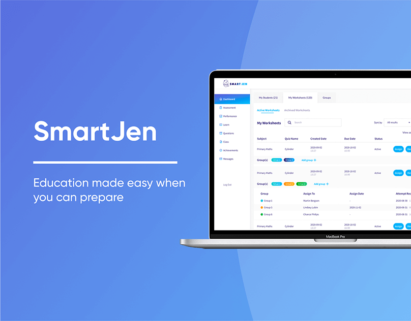
SmartJen came to RewiSoft to improve their existing web platform by suggesting new and advanced features to make the user experience more seamless. Furthermore, SmartJen’s existing website was required to be updated and redesigned according to new design trends and best practices.

SmartJen
LMS design ideas. Advice from our Design Team Lead
” The main thing you should keep in mind before designing your LMS product is your target audience. You need to consider and understand who your target audience is.
For example, working on the Smartjen project, we had a situation when we decided to conduct additional research after developing the design.
During this research, we gathered more information about what kind of children will use the platform, what a typical child looks like, what their interests are and so on.
Based on this, we realized that we need to change the design of one of the platform parts in order to make it simple, interactive and attractive for children.
The main idea is to keep an eye on your primary users and proceed from their needs. “
Anna Holishevska Design Team Lead at RewiSoft
Learning management system design methodology
Choosing a learning framework early will help you during the LMS implementation stage and beyond.
eLearning professionals and Instructional Designers are familiar with two common learning management system design methodologies – ADDIE and SAM.
ADDIE stands for Analyze, Design, Develop, Implement, Evaluate. It means that the Instructional Designer or team improves each stage before getting to the next. The shortage is that it can not be flexible enough for an environment where goals are able to change.
SAM is an acronym for Successive Approximation Model, which emphasizes permanent iteration. Both of these depend on featuring the assessment of an experienced Instructional Designer, while the modern LMS allows anyone to start developing courses.
Start UX Design
88% of online users are less likely to return to a website after a bad user experience. We can also say this about the Learning management system’s users. A poor user experience can leave a learner disengaged, overwhelmed, and irritated.
When thinking about great LMS UX design, ask yourself the following questions:
- Is the design intuitive?
- Is it easy to use?
- Is it well-organized?
- Is it enjoyable to use?
Your LMS design should be as simple as possible. If your learners can navigate the LMS without being overwhelmed, you’re on the right track! The learner does not have to worry about why those features on your LMS exist. It should be easy enough due to the LMS design. The usability should be simple so the users can explore the system themselves without any difficulties.
Testing
Testing is one of the most critical steps in the LMS design process. Visual details such as fonts, colors, alignment, and images are needed not just for the convenience of using the site but also for expressing the characteristic features of the brand, such as friendliness, reliability, or innovation.
The company can get a lot from effective branding, so visual aesthetics and its influence on users need to be tested. As in any other UX research, select participants from your target audience. They don’t need to have special knowledge in the design field. People do not need special training to understand what they like.
Ten seconds are enough for users to evaluate the design. It is not enough to just ask users whether they like the design or not. We need a more structured approach that can be divided into two main parts:
- Acquaintance with visual stimulus: Show the design to the participants of your testing process. It may be a picture, prototype, live interactive site or application.
- Assessment of the user’s reaction: Measure the reaction to the design using open or strictly controlled questions.
UI Design
An organization uses an LMS to educate its learners; thus, an LMS is only helpful to an organization if a large number of learners use it.
An easy-to-use LMS is required for a large number of learners to use an online learning platform – learners who find it challenging to use will automatically turn off.
An LMS’s User Interface is how learners interact with the platform. Icons, buttons, lists, search bars, welcome screens, and news feeds are just a few of the components that make up a modern system’s user interface.
To have an enjoyable learning environment, a learner’s contact with the system should be easy, so that it does not become an obstacle to the learner’s learning activities. As a result, an LMS UI design should be plain, appealing, and easy to use.
Testing
Your “tested material” (visual presentation of design) is easy to adapt to various types of research. With a full-time assessment of visual design, you can simply show the participants an LMS web design template.
If you show users more than one visual design option, they will determine what they like or dislike in each of the options. In this case, try to change the order of designs presentation because partially the participants’ responses depend on which option they saw first.
After the participants familiarize themselves with the design, the next step is to evaluate their answers. Users perceive the aesthetics of the design in different ways, in which case their impressions will have to analyze to determine important trends. This is possible when answering open questions.
We, at RewiSoft, use our own UX Lab for design testing and UX Eye Tracker that allows exploring user behavior during interaction with the product. Only 1% of companies use this method. It helps optimize the interface and product design.
Go to the Development stage Right
After you have created an LMS web design template, successfully tested your UI/UX design and received results, you can start the full development of your LMS system. Do not rush not to miss essential items. Take into account everything that you did at each previous stage.
How much does it cost to make a LMS design?
We can divide LMS design prices into low-cost, middle-cost and high-cost. Let’s take a look at the approximate prices for each type:
- Simple Complexity Design: Starting at up to $8,000
- Medium Complexity Design: Ranges from $8,000 to $20,000
- High Complexity Design: From $20,000 and up
The learning management system design price directly depends on what design complexity you would like to create in your project, what kind of styles you want to add, etc.


